The Most Important Forex Trading Indicators You Should Know? Think of them as your secret weapons in the wild, wild west of currency trading. Navigating the forex market without understanding these key indicators is like trying to win a poker game blindfolded – risky, to say the least. This guide breaks down the essential tools, from moving averages to the mystical Fibonacci retracements, helping you decipher market trends and make smarter trading decisions. Get ready to level up your forex game.
Forex trading is all about timing and prediction, and indicators are the tools that help you do just that. Understanding leading, lagging, and confirming indicators is crucial for making informed decisions. We’ll explore the mechanics and interpretation of each indicator, highlighting their strengths, weaknesses, and how to use them effectively in your trading strategy. Whether you’re a seasoned trader or just starting out, this deep dive will equip you with the knowledge to navigate the complexities of the forex market with confidence.
Introduction to Forex Indicators
Forex trading, with its inherent volatility and complexity, can feel like navigating a stormy sea without a compass. That’s where forex indicators come in. They’re essentially tools that analyze price movements and other market data, providing traders with valuable insights to help make informed decisions. Think of them as your navigational aids, helping you chart a course through the market’s unpredictable waters.
Understanding the role of forex indicators is crucial for successful trading. These indicators don’t predict the future, but they can highlight potential trends, support levels, resistance levels, and momentum shifts, helping traders anticipate market movements and manage risk more effectively. Ignoring this crucial aspect of forex trading is like setting sail without knowing how to read a map – you might get lucky, but you’re significantly increasing your chances of getting lost.
Indicator Types and Their Significance
Different forex indicators provide different types of information. Understanding the distinctions between these types is paramount to using them correctly and avoiding contradictory signals. Misinterpreting indicator signals can lead to poor trading decisions, resulting in losses. Choosing the right indicator, or combination of indicators, depends entirely on your trading strategy and risk tolerance.
Leading, Lagging, and Confirming Indicators
Forex indicators are broadly categorized into three main types: leading, lagging, and confirming. Leading indicators attempt to predict future price movements, lagging indicators react to past price action, and confirming indicators validate signals from other indicators or price action. A successful trading strategy often involves using a combination of these types to create a more comprehensive view of the market.
Moving Averages (MA)
Moving averages are fundamental tools in forex trading, smoothing out price fluctuations to reveal underlying trends. They help traders identify potential entry and exit points, and gauge the momentum of a currency pair. Understanding the different types of moving averages and their characteristics is crucial for effective technical analysis.
Simple Moving Average (SMA)
The Simple Moving Average calculates the average price over a specified period. It’s straightforward to understand and calculate. The calculation involves summing the closing prices for the chosen period and dividing by the number of periods. For example, a 10-day SMA sums the closing prices of the last 10 days and divides by 10.
SMA = (Sum of closing prices over n periods) / n
Where ‘n’ represents the number of periods.
Exponential Moving Average (EMA), The Most Important Forex Trading Indicators You Should Know
Unlike the SMA, the Exponential Moving Average gives more weight to recent prices, making it more responsive to recent price changes. This responsiveness is achieved through a weighting scheme that assigns exponentially decreasing weights to older data points. The calculation is more complex, involving a smoothing factor and the previous period’s EMA. While the exact formula is more intricate, the core idea is to emphasize recent price action.
Weighted Moving Average (WMA)
The Weighted Moving Average assigns different weights to each data point within the chosen period. Unlike the EMA’s exponential weighting, the WMA allows for customized weight assignments. This flexibility lets traders emphasize specific periods more heavily. For instance, a trader might assign higher weights to more recent prices to reflect a belief that recent price action is more indicative of future trends. The calculation involves multiplying each price by its assigned weight, summing the results, and dividing by the sum of the weights.
Comparison of Moving Averages
| Name | Calculation | Strengths | Weaknesses |
|---|---|---|---|
| Simple Moving Average (SMA) | Average of closing prices over ‘n’ periods | Easy to understand and calculate; provides a clear visual representation of the trend | Lagging indicator; susceptible to whipsaws; less responsive to recent price changes |
| Exponential Moving Average (EMA) | Weighted average giving more weight to recent prices | More responsive to recent price changes than SMA; smoother than SMA | More complex calculation; can be more susceptible to noise than SMA |
| Weighted Moving Average (WMA) | Weighted average with customizable weights | Flexible; allows for customized weighting schemes to emphasize specific periods | More complex calculation; requires careful selection of weights |
Moving Average Crossovers as Trading Signals
Moving average crossovers are a common trading signal. A “bullish crossover” occurs when a shorter-period MA crosses above a longer-period MA, suggesting a potential uptrend. Conversely, a “bearish crossover” occurs when a shorter-period MA crosses below a longer-period MA, hinting at a potential downtrend. For example, a 5-day EMA crossing above a 20-day EMA might be interpreted as a bullish signal, while the opposite would be considered bearish. However, it’s crucial to remember that moving average crossovers are not foolproof and should be used in conjunction with other indicators and risk management techniques.
Relative Strength Index (RSI)
The Relative Strength Index (RSI) is a momentum indicator used to measure the magnitude of recent price changes to evaluate overbought or oversold conditions in the forex market. Unlike moving averages which focus on price action itself, the RSI analyzes the speed and change of price movements, providing insights into potential trend reversals. Understanding its calculation and interpretation is crucial for any serious forex trader.
RSI Calculation and Range
The RSI is calculated using a formula that considers the average gains and losses over a specific period, typically 14 periods (days, hours, etc.). The core calculation involves comparing the average gains to the average losses. The result is then scaled to a range between 0 and 100. A higher RSI value suggests stronger upward momentum, while a lower value indicates stronger downward momentum. The exact formula is complex but readily available through most trading platforms. Essentially, it’s a ratio of the average upward movement to the total average movement (upward and downward).
Overbought and Oversold Levels and Their Significance
Traditionally, RSI readings above 70 are considered overbought, suggesting the market may be due for a correction or pullback. Conversely, readings below 30 are considered oversold, hinting at a potential bounce or upward reversal. These levels aren’t absolute rules, however. Strong trends can sustain RSI readings above 70 or below 30 for extended periods. For instance, during a strong bull market, the RSI might stay above 70 for weeks, while a prolonged bear market might keep the RSI below 30. Experienced traders often adjust these thresholds based on the specific market conditions and asset being traded. A currency pair with a history of volatile swings might show overbought conditions at 80 and oversold at 20.
RSI Divergence as a Trading Signal
RSI divergence occurs when the price of a currency pair makes a new high or low, but the RSI fails to confirm this move. For example, bullish divergence happens when the price makes a lower low, but the RSI forms a higher low. This divergence can signal a potential bullish reversal, as the momentum is weakening relative to the price action. Bearish divergence is the opposite: the price makes a higher high, but the RSI makes a lower high, suggesting a potential bearish reversal. Identifying and interpreting divergence requires careful observation of both price charts and the RSI indicator. A confirmation from other indicators or price patterns would strengthen the trading signal.
Limitations of RSI and Potential False Signals
While the RSI is a valuable tool, it’s not foolproof. Like any indicator, it can generate false signals, especially in sideways or ranging markets. The RSI might show overbought or oversold conditions that don’t translate into actual price reversals. Additionally, the choice of the period (e.g., 14 periods) can significantly impact the RSI readings. A shorter period will be more responsive to price changes but more prone to whipsaws, while a longer period will be smoother but less sensitive to short-term fluctuations. Therefore, it’s crucial to use the RSI in conjunction with other indicators and price action analysis to confirm trading signals and reduce the risk of false signals. Over-reliance on the RSI alone can lead to significant losses.
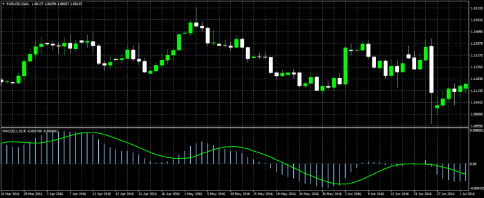
MACD (Moving Average Convergence Divergence): The Most Important Forex Trading Indicators You Should Know
The MACD, a powerful momentum indicator, helps traders identify potential trend reversals and gauge the strength of a trend. Unlike the RSI, which focuses solely on price momentum, the MACD incorporates both price and momentum, offering a more nuanced view of market dynamics. It’s built using moving averages, making it relatively easy to understand and implement.
The MACD is calculated using three exponential moving averages (EMAs) of the price: a fast EMA (typically 12 periods), a slow EMA (typically 26 periods), and a signal line (typically a 9-period EMA of the MACD line itself). The MACD line is simply the difference between the fast and slow EMAs. The signal line smooths out the MACD line, helping to filter out noise and identify clearer trading signals. Finally, the histogram visually represents the difference between the MACD line and the signal line.
You also will receive the benefits of visiting What Is a Pip in Forex Trading? today.
MACD Line, Signal Line, and Histogram Calculation
The calculation might seem daunting at first glance, but it’s essentially a series of subtractions and averaging. Let’s break it down:
MACD Line = 12-period EMA – 26-period EMA
Signal Line = 9-period EMA of the MACD Line
Histogram = MACD Line – Signal Line
The specific period lengths (12, 26, and 9) are commonly used, but traders can adjust them to suit their trading style and the specific market conditions. Shorter periods will make the indicator more sensitive to price changes, while longer periods will smooth out the data and reduce the number of false signals.
Interpreting MACD Crossovers and Divergences
MACD crossovers occur when the MACD line crosses above or below the signal line. A bullish crossover (MACD line crossing above the signal line) suggests a potential upward trend, while a bearish crossover (MACD line crossing below the signal line) suggests a potential downward trend. However, crossovers alone shouldn’t be the sole basis for a trading decision. Confirmation from other indicators or price action analysis is always recommended.
MACD divergences occur when the price action and the MACD indicator move in opposite directions. A bullish divergence happens when the price makes lower lows, but the MACD makes higher lows. This suggests weakening bearish momentum and a potential upward reversal. Conversely, a bearish divergence occurs when the price makes higher highs, but the MACD makes lower highs, indicating weakening bullish momentum and a potential downward reversal.
Notice How to Create a Forex Trading Journal for recommendations and other broad suggestions.
Comparing MACD and RSI in Identifying Momentum Changes
Both MACD and RSI are momentum indicators, but they approach the task differently. The RSI focuses solely on price changes over a specific period, while the MACD considers both price and momentum, using moving averages to smooth out price fluctuations. This means the MACD can sometimes provide more reliable signals, especially in choppy markets where the RSI might generate false signals. However, the RSI is simpler to interpret, focusing solely on the overbought/oversold conditions.
Examples of Trading Strategies Using MACD
The MACD can be used in various trading strategies, both in isolation and in combination with other indicators. Here are a few examples:
- Bullish Crossover Strategy: Enter a long position when the MACD line crosses above the signal line, and exit when the MACD line crosses below the signal line or a predetermined stop-loss is hit.
- Bearish Crossover Strategy: Enter a short position when the MACD line crosses below the signal line, and exit when the MACD line crosses above the signal line or a predetermined stop-loss is hit.
- Divergence Trading: Identify bullish or bearish divergences and enter a trade in the direction of the divergence. This strategy often requires confirmation from other indicators or price action analysis.
- MACD Histogram Strategy: Use the histogram to gauge the strength of the trend. A widening histogram suggests strengthening momentum, while a narrowing histogram suggests weakening momentum. This can be used to set stop-loss and take-profit levels.
Stochastic Oscillator
The Stochastic Oscillator is a momentum indicator that measures the speed and change of price movements. Unlike lagging indicators like moving averages, it’s considered a leading indicator, often providing early signals of potential price reversals. It’s constructed using two lines, %K and %D, each offering unique insights into market dynamics. Understanding these lines and their interplay is key to utilizing the stochastic oscillator effectively.
Stochastic Oscillator Calculation and Interpretation
The Stochastic Oscillator uses the highest high and lowest low within a specific period (typically 14 days) to calculate its values. The %K line represents the current closing price’s position relative to that period’s high-low range. The %D line is a moving average (usually a 3-period simple moving average) of the %K line, acting as a smoother, trend-following component. The formula for %K is:
%K = [(Close – Low) / (High – Low)] * 100
Where:
* Close = Current closing price
* Low = Lowest low over the lookback period (e.g., 14 days)
* High = Highest high over the lookback period (e.g., 14 days)
The %D line is calculated as a simple moving average of the %K line. A higher %K value suggests the current price is closer to the recent high, indicating bullish momentum. Conversely, a lower %K value suggests bearish momentum. The %D line helps smooth out the potentially erratic movements of the %K line, providing a clearer indication of the overall trend.
Overbought and Oversold Conditions
Generally, %K and %D values above 80 are considered overbought, suggesting the asset is potentially overvalued and a price correction or reversal might be imminent. Conversely, values below 20 are considered oversold, hinting at potential undervaluation and a possible price bounce. It’s crucial to remember that these levels are not absolute rules; they serve as guidelines. Market conditions can influence these thresholds, and breakouts above 80 or below 20 can sometimes precede further price movements in the same direction. For example, a strong uptrend might see the oscillator remain above 80 for extended periods.
Stochastic Oscillator Divergence
Stochastic oscillator divergence occurs when the price action and the oscillator move in opposite directions. Bullish divergence happens when the price makes lower lows, but the oscillator forms higher lows. This suggests weakening bearish momentum and potentially a bullish reversal. Bearish divergence, conversely, occurs when the price makes higher highs, but the oscillator forms lower highs, indicating weakening bullish momentum and a potential bearish reversal. Divergence is a powerful signal, but it should be confirmed with other indicators or price action before entering a trade. For example, a bullish divergence could be confirmed by a break above a significant resistance level.
Stochastic Oscillator vs. RSI
Both the Stochastic Oscillator and the Relative Strength Index (RSI) are momentum indicators used to identify overbought and oversold conditions and potential price reversals. However, they differ in their calculations and interpretations. RSI focuses on the magnitude of price changes over a specific period, while the Stochastic Oscillator focuses on the price’s position within its recent range. RSI tends to be smoother than the Stochastic Oscillator, which can be more volatile. Both can exhibit divergence, providing valuable insights into market sentiment and potential trend changes. Traders often use both indicators in conjunction to confirm signals and improve trading accuracy. For instance, an overbought condition in both RSI and the Stochastic Oscillator would strengthen the signal of a potential price correction.
Bollinger Bands
Bollinger Bands are a technical analysis tool that plots standard deviation bands around a moving average. This creates a dynamic range that visually represents price volatility. Understanding how to interpret these bands can significantly improve your trading strategy, providing insights into potential price reversals and breakouts.
Bollinger Bands are calculated using a simple moving average (SMA) and standard deviation. The standard deviation measures the dispersion of price data around the average. Wider bands indicate higher volatility, while narrower bands suggest lower volatility.
Bollinger Band Calculation
The core calculation involves three lines: the middle band (a simple moving average), the upper band, and the lower band. The middle band is typically a 20-period simple moving average of the closing price. The upper and lower bands are calculated by adding and subtracting a multiple of the standard deviation of the same 20-period price data to the middle band. A common multiple is two standard deviations.
The formula for the upper band is: SMA(20) + 2 * StdDev(20)
The formula for the lower band is: SMA(20) – 2 * StdDev(20)
Where SMA(20) represents the 20-period simple moving average and StdDev(20) represents the 20-period standard deviation. Adjusting the period (e.g., using a 10-period or 50-period moving average) and the standard deviation multiplier (e.g., using 1 or 3 standard deviations) can alter the sensitivity of the bands.
Interpreting Price Movements Relative to the Bands
Price movements relative to the Bollinger Bands offer valuable trading signals. When the price touches the upper band, it might suggest an overbought condition, potentially leading to a price reversal or pullback. Conversely, when the price touches the lower band, it could indicate an oversold condition, hinting at a potential price bounce. Breakouts above the upper band or below the lower band can signal strong momentum in a particular direction.
Using Bollinger Bands with Other Indicators
Bollinger Bands are powerful when used in conjunction with other indicators. For example, combining them with the Relative Strength Index (RSI) can provide a more comprehensive view of market conditions. A price touching the upper Bollinger Band while the RSI is above 70 would strengthen the overbought signal, increasing the probability of a price correction. Similarly, a price touching the lower Bollinger Band with an RSI below 30 would reinforce the oversold signal, suggesting a potential bounce. Other indicators like MACD can be used to confirm the directional bias indicated by the Bollinger Bands.
Visual Representation of Bollinger Bands
Imagine a chart displaying price action. The middle line, representing the 20-period SMA, runs horizontally through the price data. Two curved lines, the upper and lower bands, flank this middle line, creating a channel.
During a period of consolidation, the price tends to remain within the channel formed by the Bollinger Bands. The bands themselves might contract, indicating low volatility. A breakout scenario is illustrated by the price decisively breaking above the upper band, suggesting strong upward momentum, or breaking below the lower band, signaling significant downward pressure. In a consolidation phase, the price might oscillate between the upper and lower bands, bouncing off each band repeatedly before potentially breaking out. This visual representation helps traders identify potential entry and exit points based on the price’s interaction with the bands.
Fibonacci Retracement and Extensions
Fibonacci retracements and extensions are powerful tools used by forex traders to identify potential support and resistance levels, as well as project potential price targets. These tools are based on the Fibonacci sequence, a mathematical sequence where each number is the sum of the two preceding ones (e.g., 0, 1, 1, 2, 3, 5, 8, 13, 21, and so on). These numbers, when expressed as ratios, reveal key levels of price reversal or continuation.
The core concept lies in the observation that prices often retrace a certain percentage before continuing their trend. Fibonacci ratios, derived from the sequence, are commonly used to pinpoint these retracement levels. Similarly, Fibonacci extensions help predict how far a price might move after a retracement.
Fibonacci Ratios and Their Application in Forex Trading
The most commonly used Fibonacci ratios in forex trading are 23.6%, 38.2%, 50%, 61.8% (the Golden Ratio), and 78.6%. These ratios represent potential levels where the price might pause or reverse its direction. For instance, if a currency pair experiences a significant upward trend, a retracement to the 38.2% Fibonacci level might signal a buying opportunity for traders anticipating a continuation of the uptrend. Conversely, a break below the 38.2% level could suggest a weakening of the uptrend. The application of these ratios isn’t limited to uptrends; they are equally applicable to downtrends, where the ratios identify potential bounce points.
Identifying Potential Support and Resistance Levels Using Fibonacci Retracements
Fibonacci retracements are drawn on a chart by identifying a swing high and a swing low (or vice-versa, depending on the trend). The tool then calculates and displays horizontal lines at the key Fibonacci ratios (23.6%, 38.2%, 50%, 61.8%, 78.6%) between those two points. These horizontal lines represent potential support and resistance levels. If the price approaches one of these levels, traders may anticipate a price reversal or a pause in the current trend. For example, if the price retraces to the 38.2% level and bounces, it might suggest that the underlying trend remains intact. Conversely, a break below the 38.2% level could signal a stronger reversal.
Using Fibonacci Extensions to Project Potential Price Targets
Fibonacci extensions build upon retracements by projecting potential price targets beyond the initial swing high or low. After identifying a retracement, traders can use the Fibonacci extension tool to project potential price targets based on the extended Fibonacci ratios, typically 127.2%, 161.8%, and 261.8%. These levels represent potential areas where the price might encounter resistance (in an uptrend) or support (in a downtrend) before continuing its move. For example, if the price retraces to the 38.2% level and then resumes its uptrend, the 161.8% Fibonacci extension level could serve as a potential price target.
Steps for Identifying Fibonacci Levels on a Chart
Identifying Fibonacci levels on a chart involves a systematic approach:
- Identify a swing high and a swing low (or vice-versa): These represent significant price peaks and troughs in the chart.
- Apply the Fibonacci retracement tool: Most charting platforms offer a built-in Fibonacci retracement tool. Select the tool and draw a line from the swing high to the swing low (or vice-versa).
- Observe the retracement levels: The tool will automatically generate horizontal lines at the key Fibonacci ratios (23.6%, 38.2%, 50%, 61.8%, 78.6%).
- Identify potential support and resistance: These horizontal lines represent potential areas where the price might find support or resistance.
- (For extensions) Extend beyond the swing points: Using the Fibonacci extension tool, project potential price targets beyond the initial swing high or low based on the extended Fibonacci ratios (127.2%, 161.8%, 261.8%).
Remember, Fibonacci tools are not foolproof. They should be used in conjunction with other technical indicators and analysis to confirm trading signals. They provide probabilities, not certainties.
Volume Indicators
Price action alone doesn’t tell the whole story in forex trading. Understanding volume, the amount of currency traded at a given price, adds a crucial layer of confirmation and context to your analysis. High volume accompanying a price move suggests strong conviction behind that move, while low volume might indicate a weak trend prone to reversal. Essentially, volume acts as a filter, helping you separate significant price changes from noise.
Volume indicators provide a visual representation of trading activity, allowing you to identify periods of high and low participation in the market. This insight can improve your trade entry and exit decisions, enhancing your risk management and overall profitability.
On-Balance Volume (OBV)
On-Balance Volume is a cumulative indicator that sums volume when prices increase and subtracts volume when prices decrease. A rising OBV line, even if the price is slightly consolidating, suggests bullish accumulation, while a falling OBV line despite minor price increases points to potential weakness. OBV divergences, where the price makes new highs but OBV fails to do so (or vice versa), are often considered strong signals of potential trend reversals. For example, if the price of EUR/USD is making higher highs but the OBV is making lower highs, it could suggest that buying pressure is waning and a price correction might be imminent. This divergence acts as a warning sign, prompting traders to reconsider their long positions or tighten their stop-losses.
Volume Weighted Average Price (VWAP)
The Volume Weighted Average Price calculates the average price weighted by volume. Traders often use VWAP as a benchmark for intraday trading. Prices above the VWAP might indicate strength, while prices below it suggest weakness. For instance, a breakout above the VWAP, accompanied by a surge in volume, could be a strong signal to enter a long position. Conversely, a break below the VWAP with increasing volume might signal a potential short opportunity. VWAP is particularly useful in identifying potential support and resistance levels throughout the trading day.
Interpreting Volume Data Alongside Price Action
Combining volume data with price action is key. A significant price move supported by high volume is more likely to continue than a similar move with low volume. For example, a bullish candlestick pattern with high volume confirms the bullish pressure, increasing the likelihood of further price appreciation. Conversely, a bearish candlestick pattern accompanied by low volume might suggest the trend is weakening and could be susceptible to a reversal. Analyzing volume alongside candlestick patterns, support and resistance levels, and other indicators provides a more comprehensive and accurate picture of market dynamics.
Comparison of Volume Indicators
While both OBV and VWAP utilize volume data, they offer different perspectives. OBV focuses on the cumulative effect of volume over time, highlighting bullish or bearish accumulation. VWAP, on the other hand, provides a weighted average price, useful for intraday trading and identifying potential support and resistance levels. The choice between them depends on your trading style and timeframe. Scalpers might favor VWAP for intraday decisions, while swing traders could find OBV more valuable for identifying longer-term trends. Ultimately, using a combination of indicators can often provide a more complete picture than relying on any single indicator alone.
Ultimate Conclusion
Mastering forex trading isn’t about luck; it’s about knowledge and strategy. By understanding and skillfully applying the indicators discussed—moving averages, RSI, MACD, stochastic oscillators, Bollinger Bands, Fibonacci retracements, and volume indicators—you equip yourself with a powerful toolkit for navigating market volatility and identifying profitable opportunities. Remember, consistent practice and disciplined risk management are key to success. So, go forth and conquer the forex world!
Popular Questions
What’s the difference between leading and lagging indicators?
Leading indicators predict future price movements, while lagging indicators confirm past trends. Think of leading indicators as forward-looking scouts, and lagging indicators as historians analyzing the battle after it’s over.
Can I use multiple indicators simultaneously?
Absolutely! Combining indicators can provide a more comprehensive view of the market, but be mindful of potential conflicting signals. It’s like having multiple advisors – you need to weigh their opinions carefully.
How often should I check my indicators?
The frequency depends on your trading style and the timeframe you’re focusing on. Scalpers might check every few minutes, while swing traders might check daily or even weekly.
Are these indicators foolproof?
Nope! No indicator is perfect. Market conditions can change rapidly, and false signals are always a possibility. Always use indicators in conjunction with sound risk management practices.